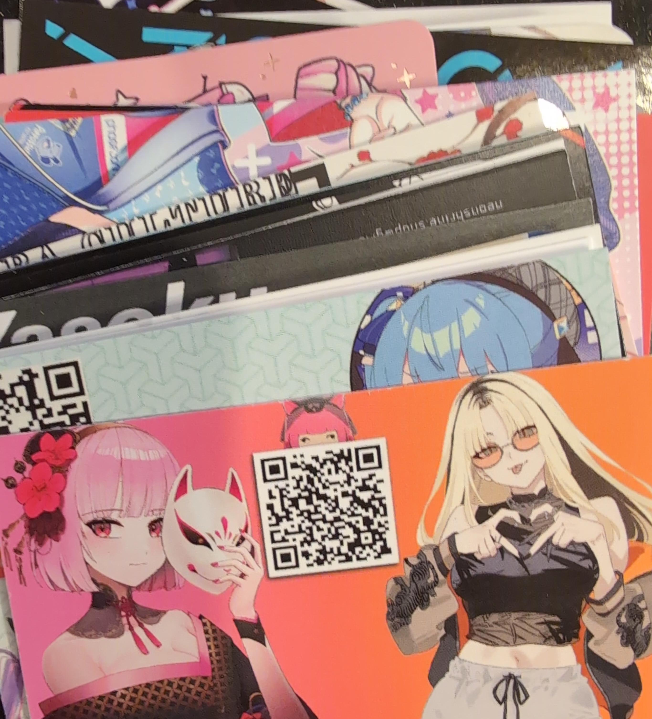
 It’s nice to have lots of examples to refer to when you’re trying to make something! The two cards at the top of the pile pictured are bona fide oshi cards given by other hololive fans during the course of oshikatsu at conventions and other events!
Illustrator’s cards
Xeph
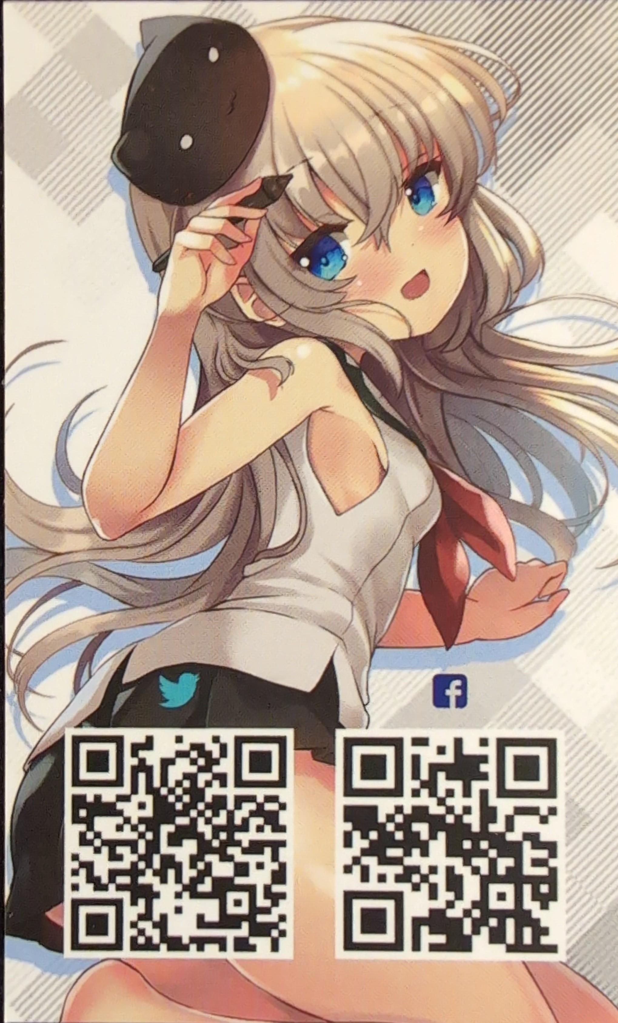 Business card obtained from an artist alley (likely ANYC 2024).
Front side is a vertical card showing off his OC(?) on a white background with some nice patterns, いい脇w. The two separate QR codes and the icons are almost lost in all the detail as they only stand out due to the use of color. The QR codes could be consolidated into one by having landing page (linktree, carrd, etc) and improved by
- putting the logo(s) in the center
- using different shapes or colors
- placing the entire code on backside so the focus is squarely on the art
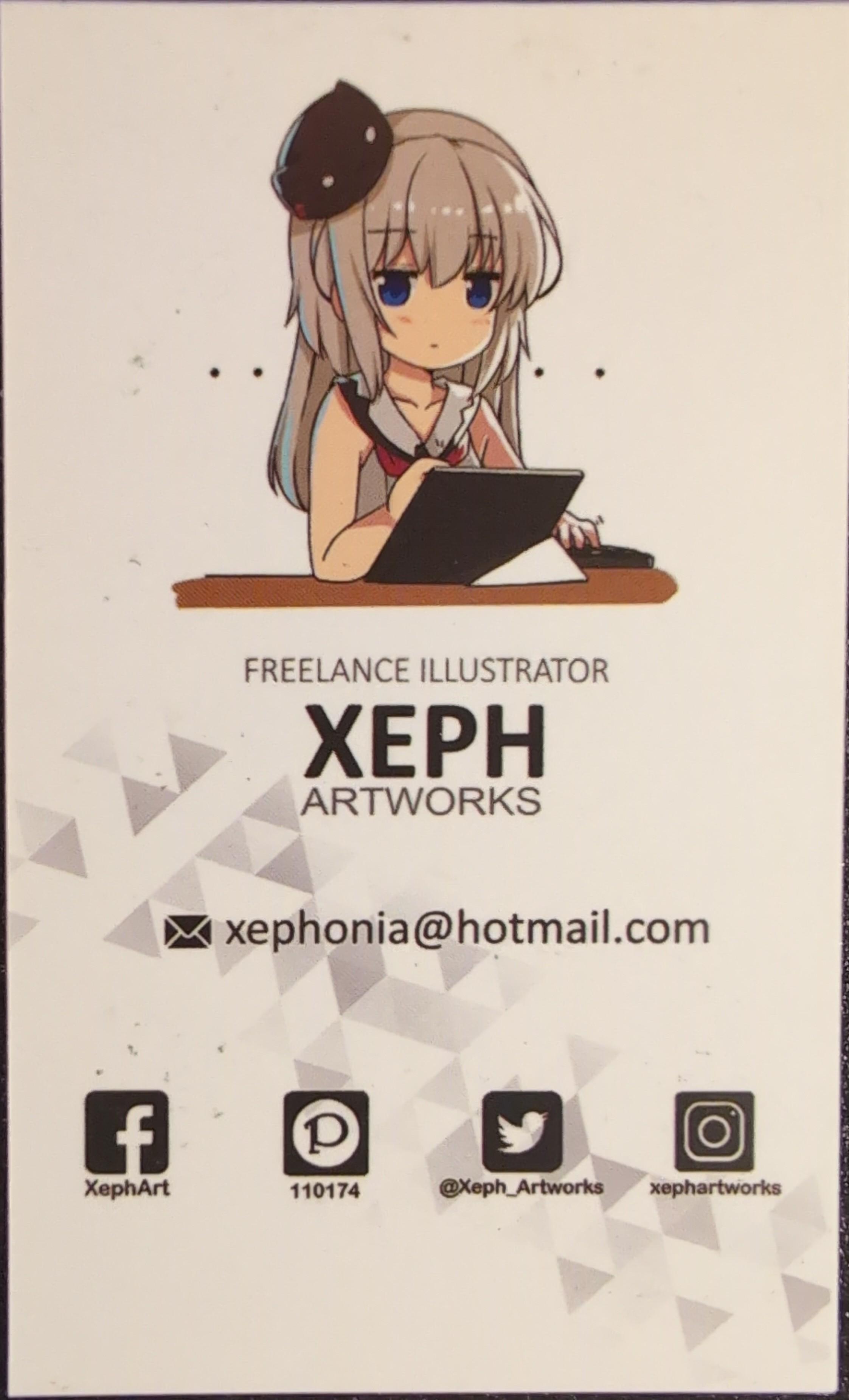 Back side is a tasteful vertical card with the OC(?) drawing on a desk with high contrast black/white font and monochrome logos for contact info. The background is mostly a blank white with a sparse scattered triangle pattern towards the lower third to break up the monotony. However the grey pattern degrades the legibility of the email text and twitter logo a little.
Kurinyan
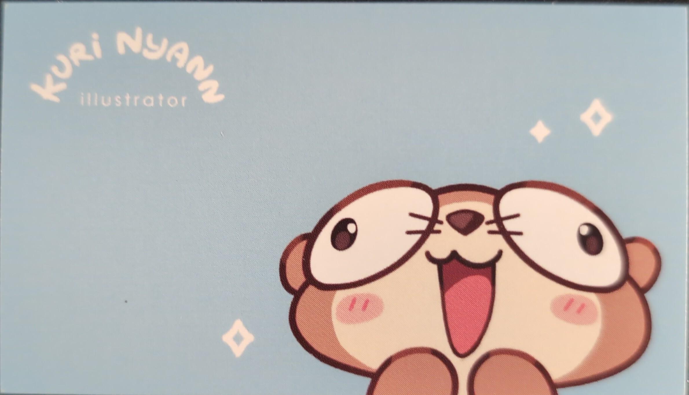 Business card obtained from an artist alley.
Front side is a horizontal card on a mostly blank light blue background with the illustrator’s name and a cute otter(?) drawing. The monotony is broken up by hand drawn stars.
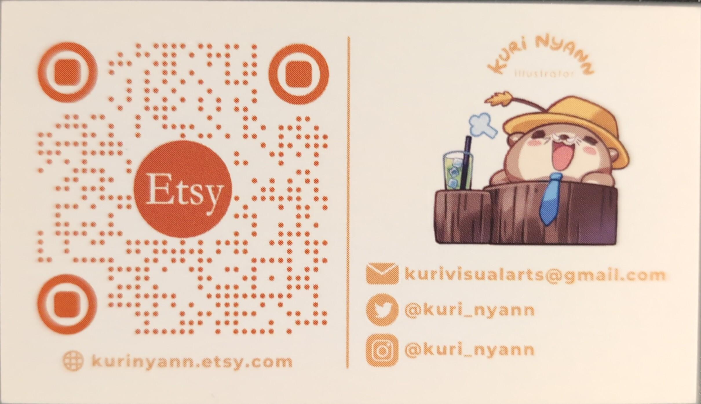 Back side is also horizontal with a pale orange background. It’s split into two sections: on the left there is a giant custom QR code for the Etsy shop; on the right there’s the illustrator’s contact and social media handles with another cute illustration.
The QR code is pretty unique, but I think the small dots make it pretty hard to scan. Had to move and rotate my phone camera around quite a bit to get it recognized.
Yaruki
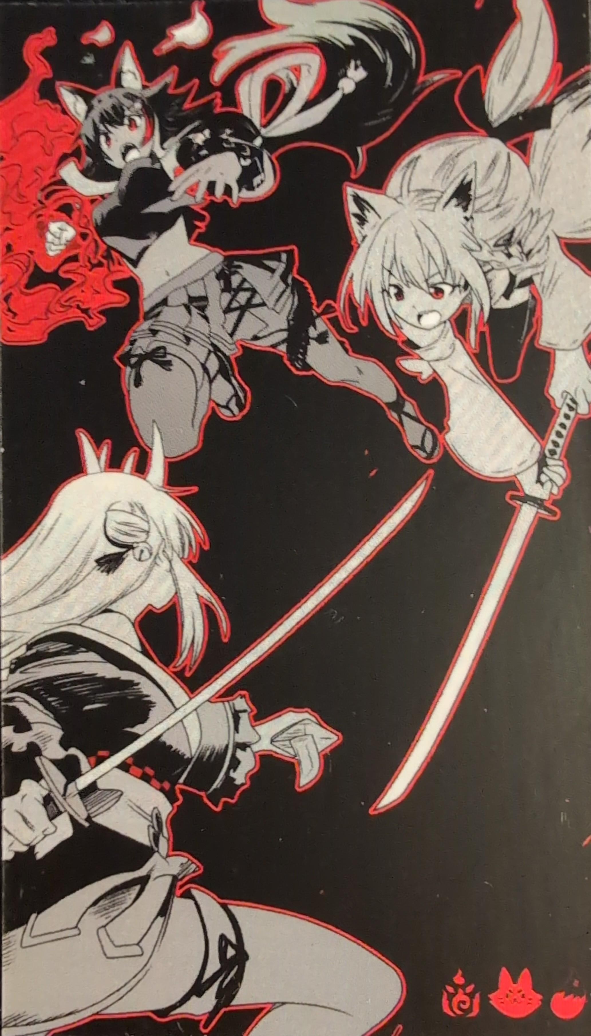 Business/oshi card obtained by mail mail order.
Front side is a vertical card with an awesome black, white, and red illustration depicting AyaFubuMi. The print quality is good and it’s basically a mini art print. However, it behooves me to point out that using deep, dark backgrounds on business cards can result in ugly edges if the card is handled roughly. See the edges of the photos where the color of the paper fibers clashes with the printed color.
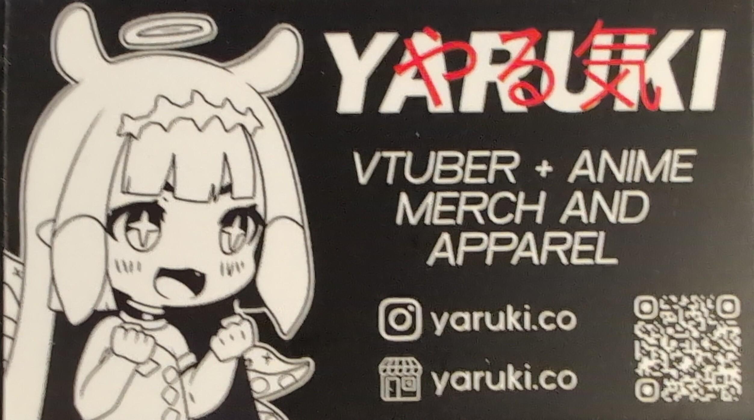 On the back side, we have a black and white horizontal card that’s two sections: on the left we have a cute chibi illustration of Ina; on the right we have Yaruki’s branding (with やる気 in red), tagline, and social media/website. There’s also a tiny QR at the bottom right, but there’s no problems scanning it in person (the photos I’m posting aren’t the greatest quality).
davanchiart
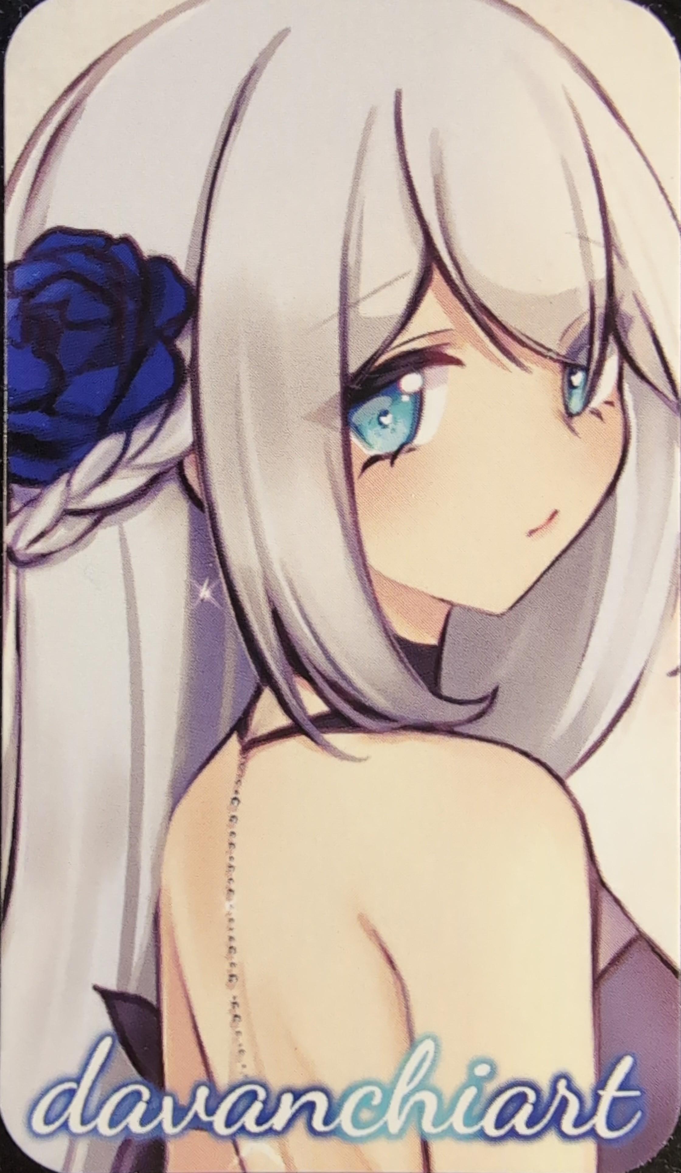 Business card obtained from an artist alley.
Front side is a vertical card featuring an OC(?) standing side profile looking at the viewer with a white background and trimmed round corners. The illustration zoomed and cropped in closely so that emphasis is on the head, hair, and bare back as the OC is wearing a backless dress. The illustrator’s name is on the bottom in a cursive font with emphasis on “chi” as it’s a different color.
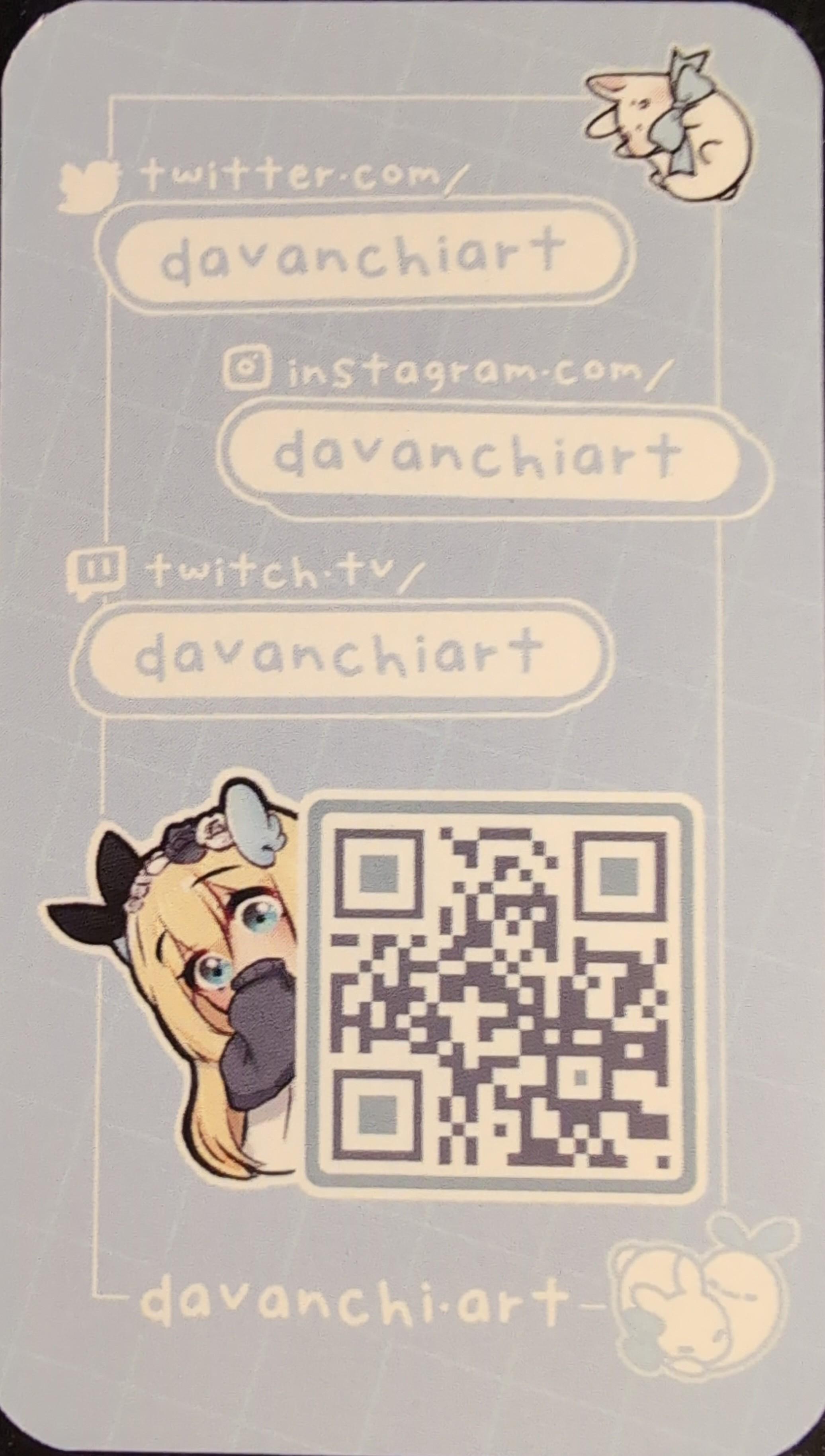 Back side is also vertical with the same light blue background using a widely spread white square pattern offset diagonally to break up the monotony. There’s a large white frame with cute chibi illustrations, hand-drawn style font and rounded boxes advertising various platform links, and a lightly customized QR code. It’s full of personality and charm!
There’s little criticism to be had except for the somewhat low contrast QR code colors which may not work in poor lighting.
STILL WIP. MORE TO COME.